


Introduction
Our dearest, Dark Mode needs no introduction of any sorts. Good websites and apps have it and it's an absolute blessing for those who have their eyes glued at the screen all the time. 👀
Since Android 10 and iOS 13 also support dark mode natively let's look at how we can leverage that to implement dark mode in our apps. We'll be using React's Context API to share active theme throughout our app along with React Native's useColorScheme hook.
1. Creating some components 💻
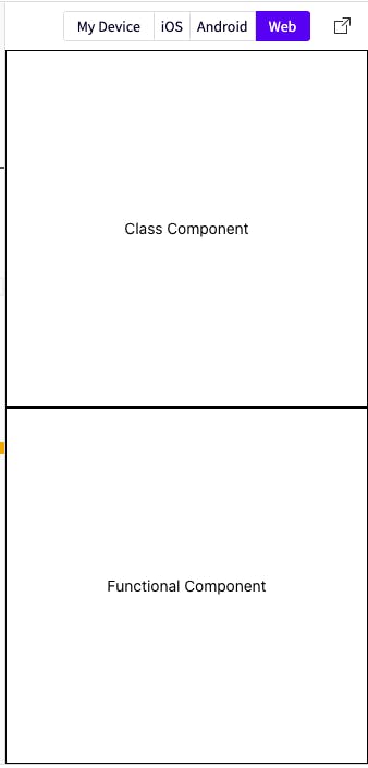
Assuming that we have a barebone React Native project up and running, let's start by creating a functional and a class component inside /components folder and update our App.js. So we have something like this.
- Functional component
// /components/FunctionalComponent.js

import React from 'react';
import { View, Text, StyleSheet } from 'react-native';

const FuntionalComponent = (props) => {
  return (
    <View style={stylesheet.container}>
      <Text style={stylesheet.text}>Functional</Text>
    </View>
  );
};

const stylesheet = StyleSheet.create({
  container: {
    flex: 1,
    justifyContent: 'center',
    alignItems: 'center',
    backgroundColor: '#FFF',
    borderColor: '#000',
    borderWidth: 1,
  },
  text: {
    color: '#000',
  },
});

export default FuntionalComponent;
We create a similar class component named ClassComponent.
Importing them inside App.js, we have,
// /App.js

import React from 'react'

import ClassComponent from './components/ClassComponent'
import FunctionalComponent from './components/FunctionalComponent'

const App = () => {
  return (
    <>
      <ClassComponent />
      <FunctionalComponent />
    </>
  )
}

export default App
Here's an expo screenshot of our app until now.
2. Declaring themes
Let's create a folder themes where we will declare our theme object corresponding to the light and dark mode in themes.js
// /themes/themes.js

const light = { backgroundColor: 'white', textColor: 'black' }
const dark = { backgroundColor: 'black', textColor: 'white' }

export { light, dark }
3. Creating ThemeContext
// /themes/ThemeContext.js

import React, {  useContext } from 'react';

import { light, dark } from './themes';

const ThemeContext = React.createContext({
  themeMode: 'light',
  themes: { light, dark },
  toggleTheme: () => {},
});
We created a simple context which will hold 3 things
themeMode: Current active theme i.e.lightordark. This will act as a single source of truth throughout the app.themes: All available theme objects.toggleTheme: A function to toggle themes.
4. Creating a ContextProvider
In the previous section, notice that our toggleTheme is a dummy function. To supply a working function and providing a way to update our theme, we will create a simple react component that wraps over our ThemeContext's provider.
We will be using useColorScheme available in react-native v0.62 and above. For lower version, we can use react-native-appearance instead.
In case if you are not using expo then make sure to add this in
MainActivity.java
// /themes/ThemeContext.js

import React, {  useState } from 'react';
import { useColorScheme } from 'react-native';

const ThemeProvider = (props) => {
  // currentTheme is either 'dark' or 'light'
  const currentTheme = useColorScheme()

  const [themeMode, setThemeMode] = useState(currentTheme);

  const toggleTheme = () => {
    if (themeMode === 'light') {
      setThemeMode('dark');
    } else {
      setThemeMode('light');
    }
  };

  return (
    <ThemeContext.Provider
      value={{ themeMode, themes: { light, dark }, toggleTheme }}>
      {props.children}
    </ThemeContext.Provider>
  );
};
We manage our current theme inside themeMode and finally define the toggleTheme function and pass all the values to ThemeContext.Provider via value prop.
5. Wrapping our App.js with ThemeProvider
import ThemeProvider from './themes/ThemesContext'

const App = () => {
  return (
-   <>
+  <ThemeProvider>
      <ClassComponent />
      <FunctionalComponent />
-   </>
+  </ThemeProvider>
  )
}
6. Accessing theme inside our components
To access the current theme inside our components. We define a hook and a HOC for functional and class components respectively.
Our hook and HOC will take a function styleSheetBuilder which will be called with the current theme i.e. styles = styleSheetBuilder(theme). This styles object will then be accessible inside our components.
By following this approach of supplying a function, instead of just receiving
themeobject inside our components, we can keep the theming logic away from our components.
Okay enough words, let's jump to the code already
Our useThemehook looks like this. Pretty simple!
// /themes/ThemeContext.js

export const useTheme = (stylesheetBuilder) => {
  const { themeMode, themes, toggleTheme } = useContext(ThemeContext);
  const theme = themes[themeMode];
  const styles = stylesheetBuilder(theme);
  return { styles, themeMode, toggleTheme };
};
Similarly, we define a HOC withTheme for class components, which in turn will uses useTheme internally.
// /themes/ThemeContext.js

export const withTheme = (stylesheetBuilder) => {
  return function (Component) {
    const WithTheme = (props) => {
      const { styles, themeMode, toggleTheme } = useTheme(stylesheetBuilder);
      return (
        <Component
          styles={styles}
          themeMode={themeMode}
          toggleTheme={toggleTheme}
        />
      );
    };
    WithTheme.displayName = `withTheme(${getDisplayName(Component)})`;
    return WithTheme;
  };
};

function getDisplayName(Component) {
  return Component.displayName || Component.name || 'Component';
}
And our components will have access to themed styles, current theme themeMode and toggleTheme.
withThemeis using function currying to provide an API similar to that ofredux'sconnectfunction.Adding a
displayNameproperty helps in easy debugging in React Devtools. Read more about it here
7. Wiring up the components with useTheme and withTheme
We update our stylesheet inside both the components to be a function that receives the current theme object and sets the backgroundColor and color accordingly.
- const stylesheet = StyleSheet.create({
+ const stylesheet = (theme) => (StyleSheet.create({
  container: {
    flex: 1,
    justifyContent: 'center',
    alignItems: 'center',
-   backgroundColor: '#FFF',
+  backgroundColor: theme.backgroundColor,
-   borderColor: '#000',
+  borderColor: theme.borderColor,
    borderWidth: 1,
  },
  text: {
-     color: '#000',
+    color: theme.textColor,
  },
- });
+ }));
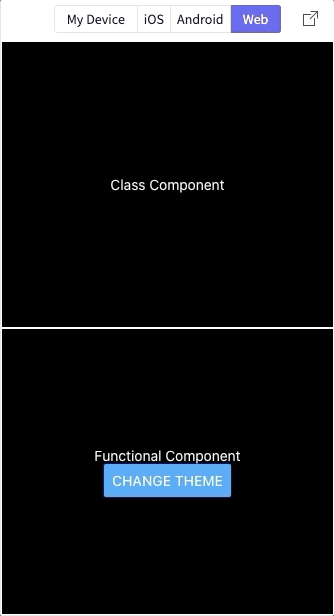
And now we simply pass the updated stylesheet to both our components. Let's also add a button to toggle our theme from inside the functional component. And our updated component looks like this.
import { View, Text, Button } from 'react-native';
+ import { useTheme } from '../themes/ThemeContext';

const FuntionalComponent = (props) => {
+  const { styles, toggleTheme } = useTheme(stylesheet);
  return (
    <View style={styles.container}>
      <Text style={styles.text}>Functional</Text>
+      <Button title="Change Theme" onPress={toggleTheme} />
    </View>
  );
};
Similarly, we can use withTheme to wrap our class component like this withTheme(stylesheet)(ClassComponent)
At last this is how our app looks like.
Aaaannnnd we are finally done 🎉🎊 !!
.
.
.
.
.
.
.
Well almost 😬 😬
If we notice carefully, whenever our components re-render, we get a new styles object even if the theme hasn't changed which may not be the desired behavior. Since as long as our theme doesn't change, we expect the components to receive the same styles object. 🤔
This behavior can be verified by adding a
componentDidUpdateinsideClassComponentand comparing ifprevProps.styles===this.props.styles.
8. A final optimization 🔨
So to avoid this issue, we'll make use of another hook useMemo inside our useTheme hook.
export const useTheme = (stylesheetBuilder) => {
  const { themeMode, themes, toggleTheme } = useContext(ThemeContext);
  const theme = themes[themeMode];
- const styles = stylesheetBuilder(theme);
+ const styles = useMemo(() => stylesheetBuilder(theme), [themeMode]);
  return { styles, themeMode, toggleTheme };
};
And with this change, our styles object is memoized and no longer changes reference between re-renders as long as the themeMode is the same. Noice! 😁
Congratulations on making it till the end. 🎉🎊
Feel free to reach me with any questions or suggestions.❤️😄
Here's a snack demo of the final changes. Feel free to fiddle around with it.
Peace out and ....